

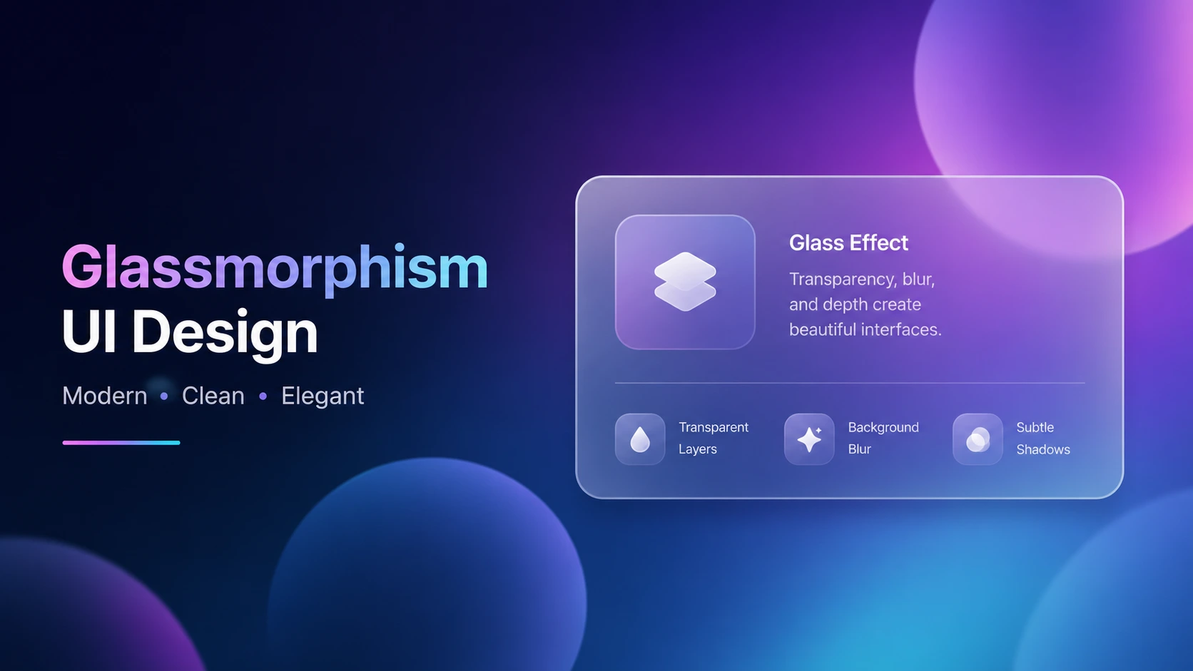
Modern websites often use more than simple colors and flat cards to create visual depth. One of the most recognizable styles is glassmorphism UI design, a technique that combines transparency, background blur, soft borders, and subtle shadows to make interface elements look like frosted glass.
The effect can make dashboards, landing pages, navigation bars, cards, and login screens feel more polished. The good news is that you can create much of the effect with standard CSS instead of relying on image editing software.
In this guide, you will learn what glassmorphism is, how it works, which CSS properties create the effect, common mistakes to avoid, and how to build a practical glass UI.
What Is Glassmorphism UI Design?
Glassmorphism UI design is a visual interface style that uses translucent surfaces, background blur, subtle borders, soft shadows, and colorful backgrounds to create a frosted-glass appearance. The main CSS property behind the effect is usually backdrop-filter, which can blur or modify the content behind a partially transparent element.
A typical glassmorphism component contains:
- A semi-transparent background
- Background blur
- A subtle light or dark border
- Rounded corners
- A soft shadow
- A colorful or layered background behind it
The important idea is simple: the glass effect needs something interesting behind the glass to reveal the depth.
How Does Glassmorphism Work in CSS?
Glassmorphism is not a single CSS property. It is a combination of several properties working together.
The most important one is backdrop-filter.
Unlike filter, which can affect the element itself, backdrop-filter applies graphical effects to the area behind an element. This makes it especially useful for frosted-glass interfaces.
Here is a basic example:
.glass-card { background: rgba(255, 255, 255, 0.18); backdrop-filter: blur(12px); -webkit-backdrop-filter: blur(12px); border: 1px solid rgba(255, 255, 255, 0.25); border-radius: 20px; box-shadow: 0 8px 32px rgba(0, 0, 0, 0.15); }This small combination creates the foundation of a glassmorphism component.
The Main Glassmorphism Properties
| CSS Property | Purpose |
|---|---|
| background | Creates the translucent surface |
| backdrop-filter | Blurs the background behind the surface |
| border | Creates the glass edge |
| border-radius | Produces rounded glass corners |
| box-shadow | Adds depth and separation |
| color | Controls readable foreground content |
The exact values should change based on your background, content, and overall visual style.
The Five Core Elements of Glassmorphism
1. Transparency
Transparency is the foundation of the glass effect.
A fully opaque background hides everything underneath it, so the surface stops looking like glass. Instead, use a partially transparent color such as:
background: rgba(255, 255, 255, 0.15);You can also use modern color syntax:
background: rgb(255 255 255 / 15%);The right transparency depends heavily on the background.
Tip: If the background is very colorful, you may need a stronger surface color to keep text readable.
2. Background Blur
The blurred background is what makes the surface feel frosted.
backdrop-filter: blur(12px);For a stronger effect:
backdrop-filter: blur(20px);MDN documents backdrop-filter as supporting effects such as blur(), brightness(), contrast(), saturate(), and others.
A common beginner mistake is adding backdrop-filter but using an opaque background. If the foreground completely blocks the background, there is little or nothing visible to blur.
3. Subtle Borders
A thin border helps define the edge of the glass surface.
For a light glass interface:
border: 1px solid rgba(255, 255, 255, 0.25);For a dark interface:
border: 1px solid rgba(255, 255, 255, 0.12);Keep the border subtle. A thick, bright border can make the interface look more like a traditional card than glass.
4. Rounded Corners
Glassmorphism usually works best with rounded corners.
border-radius: 20px;The radius should match the rest of your design system. A dashboard might use 16px to 24px, while a small button may need a smaller radius.
5. Soft Shadows
A glass panel still needs separation from the background.
box-shadow: 0 8px 32px rgba(0, 0, 0, 0.15);Avoid extremely dark shadows. Glass usually looks better when the shadow is soft and wide rather than harsh and concentrated.
A Complete Glassmorphism Example
Here is a simple practical example combining the main techniques:
body { min-height: 100vh; margin: 0; background: radial-gradient(circle at 20% 20%, #7c3aed, transparent 35%), radial-gradient(circle at 80% 70%, #06b6d4, transparent 35%), #111827; display: grid; place-items: center; } .glass-card { width: min(90%, 420px); padding: 32px; color: white; background: rgba(255, 255, 255, 0.14); backdrop-filter: blur(16px); -webkit-backdrop-filter: blur(16px); border: 1px solid rgba(255, 255, 255, 0.22); border-radius: 24px; box-shadow: 0 20px 50px rgba(0, 0, 0, 0.2); }The colorful background is important because the blurred shapes behind the card create the visual depth that makes the glass effect noticeable.
Glassmorphism vs Traditional Flat UI
Glassmorphism is not automatically better than flat design. The right choice depends on the purpose of the interface.
| Feature | Glassmorphism | Flat UI |
|---|---|---|
| Transparency | Common | Rare |
| Background blur | Common | Rare |
| Visual depth | High | Low to moderate |
| Simplicity | Can become complex | Usually simple |
| Decorative backgrounds | Important | Less important |
| Performance considerations | Higher | Usually lower |
| Best use | Hero sections, dashboards, overlays | Content-heavy interfaces |
For a productivity application with lots of text and controls, excessive glass effects can reduce clarity. For a landing page or visual dashboard, glassmorphism can add personality without requiring complex graphics.
Where Should You Use Glassmorphism?
Glassmorphism works particularly well when you want visual depth around important interface elements.
Good use cases include:
- Hero sections
- Login and signup cards
- Pricing cards
- Music players
- Weather dashboards
- Analytics dashboards
- Floating navigation
- Modal windows
- Media controls
- Profile cards
- Product showcases
For example, a dashboard could use a colorful gradient background with several translucent cards. Each card can contain a KPI, chart, or action while the background remains partially visible.
For image-heavy projects, you can also combine the design with an Image Compressor to keep page assets smaller.
How to Create Better Glassmorphism Designs
The biggest mistake is treating glassmorphism as an effect rather than a design system.
Follow these practical rules.
Keep the Background Interesting
Glass needs something behind it.
Use:
- Gradients
- Abstract shapes
- Blurred circles
- Images
- Subtle color transitions
A plain white background with a transparent white card will rarely produce an impressive glass effect.
Don't Make Everything Glass
If every element is transparent, nothing feels special.
Use glass strategically for the elements that need emphasis.
For example:
- Header: glass
- Main card: glass
- Buttons: solid
- Body text: normal
- Secondary sections: normal
This creates hierarchy.
Prioritize Readability
Beautiful UI is useless if users cannot read it.
Make sure there is enough contrast between text and the background. A blur effect may improve readability in some situations, but it does not automatically make text accessible.
If text becomes difficult to read, increase the surface opacity, simplify the background, or change the text color.
You can also use a Color Contrast Checker if your site includes a relevant tool.
Use Blur Carefully
More blur does not always mean better glass.
Try values such as:
backdrop-filter: blur(8px);
backdrop-filter: blur(16px);
backdrop-filter: blur(24px);
Then compare them visually.
A subtle 8px to 16px blur can often be enough for cards, while larger values may work better for large navigation or overlay surfaces.
Common Glassmorphism Mistakes
Too Much Transparency
If the background is too visible, content can become difficult to read.
Fix: Increase the background opacity.
Excessive Blur
Very strong blur can make the interface feel muddy.
Fix: Start with moderate blur and increase it only when necessary.
Heavy Shadows
Dark shadows can make glass cards look artificial.
Fix: Use a larger blur radius and lower opacity.
No Visual Hierarchy
If every component has identical glass styling, users may not know where to look.
Fix: Reserve stronger effects for primary elements.
Ignoring Performance
Visual effects can have rendering costs, particularly when many large elements use backdrop filtering.
Fix: Keep the number and size of heavily filtered elements reasonable and test the design on real devices. web.dev specifically recommends testing performance when using backdrop-filter.
Browser Support and Fallbacks
Modern browsers have broad support for backdrop-filter, but older browsers and devices may behave differently. MDN currently lists backdrop-filter as Baseline 2024, meaning it is broadly available in current browser versions but may not work in older environments.
You should therefore provide a sensible fallback.
For example:
.glass-card { background: rgba(255, 255, 255, 0.85); } @supports (backdrop-filter: blur(12px)) { .glass-card { background: rgba(255, 255, 255, 0.18); backdrop-filter: blur(12px); } }This gives unsupported browsers a readable solid background instead of leaving users with a broken-looking component.
For more CSS experimentation, you can also use the CSS Gradient Generator to create the colorful background behind your glass components.
Glassmorphism Generator: A Faster Way to Experiment
Manually adjusting transparency, blur, borders, shadows, and colors can become repetitive.
A Glassmorphism Generator can make this process much faster by letting you experiment with the visual settings and generate the CSS values you need.
A practical workflow is:
1. Choose a background color or gradient.
2. Set the glass background opacity.
3. Adjust blur intensity.
4. Choose border transparency.
5. Adjust border radius.
6. Add a subtle shadow.
7. Check text readability.
8. Copy the generated CSS.
9. Test it on desktop and mobile.
10. Fine-tune the result inside your project.
This is especially useful when you want to compare several visual styles quickly instead of manually changing CSS values one by one.
A Simple Glassmorphism Design Formula
If you are unsure where to start, use this basic formula:
Transparent background + background blur + subtle border + rounded corners + soft shadow + readable text = glassmorphism
For example:
background: rgba(255, 255, 255, 0.15); backdrop-filter: blur(16px); border: 1px solid rgba(255, 255, 255, 0.25); border-radius: 20px; box-shadow: 0 12px 40px rgba(0, 0, 0, 0.15);Treat these values as a starting point, not a universal recipe.
Quick Glassmorphism Checklist
Before publishing a glass-style interface, check:
- Is the text easy to read?
- Is the background visually interesting but not distracting?
- Is transparency strong enough to reveal the background?
- Is the blur noticeable but not excessive?
- Are borders subtle?
- Are shadows soft?
- Are glass effects limited to important components?
- Does the interface work on mobile?
- Does the design have a fallback?
- Have you tested performance on real devices?
Frequently Asked Questions
What is glassmorphism UI design?
Glassmorphism UI design is a visual style that makes interface elements resemble frosted glass. It typically combines semi-transparent backgrounds, background blur, subtle borders, rounded corners, and soft shadows. The technique is commonly created with CSS using the backdrop-filter property.
What CSS property creates the glass effect?
The main CSS property is backdrop-filter. It applies graphical effects to the area behind an element. For a typical glass effect, developers combine backdrop-filter: blur(...) with a semi-transparent background so the blurred content remains visible through the surface.
Is glassmorphism good for websites?
Yes, when used carefully. Glassmorphism can work well for hero sections, dashboards, overlays, navigation, and feature cards. However, using glass effects everywhere can hurt readability and visual hierarchy. Content-heavy websites often benefit from using glassmorphism selectively rather than making every component translucent.
Does glassmorphism affect website performance?
It can. Effects such as background blur require additional rendering work, particularly when applied to large or numerous elements. For this reason, keep heavily filtered areas reasonable and test your interface on real desktop and mobile devices before launch.
How can I create glassmorphism CSS faster?
You can start with a transparent background, backdrop-filter: blur(), a subtle border, rounded corners, and a soft shadow. A Glassmorphism Generator can speed up experimentation by allowing you to adjust these values visually and copy the resulting CSS.
Conclusion
Glassmorphism UI design is more than making a card transparent. The best results come from combining transparency, background blur, subtle borders, rounded corners, shadows, and a carefully designed background.
Use the effect selectively, prioritize readability, and test performance instead of adding glass effects to every component.
Ready to build your own glass interface? Try the Glassmorphism Generator and experiment with different blur, transparency, border, and shadow combinations. Then explore more free CSS and design tools on TechbyJeel Tools.