

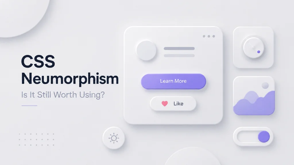
Neumorphism became one of the most recognizable UI design trends because it made interfaces look soft, tactile, and almost physical. By combining a background color with carefully positioned light and dark shadows, designers could make buttons and cards appear raised or pressed into the page.
But design trends move quickly. So, is CSS neumorphism still worth using in 2026?
The short answer is yes, but only when used carefully. Neumorphism can create an attractive visual style, but using it across an entire interface can hurt contrast, usability, and accessibility.
In this guide, you'll learn how CSS neumorphism works, where it performs well, its biggest problems, and how to use the style without sacrificing usability.
What Is CSS Neumorphism?
CSS neumorphism is a UI design technique that uses a matching background color with light and dark shadows to make interface elements appear raised from or pressed into the surface. It is commonly created with CSS properties such as background, border-radius, and multiple box-shadow values. CSS supports both regular and inset shadows, which makes this effect possible without images.
Unlike traditional flat design, neumorphism tries to create the illusion that interface elements are physically part of the same surface.
A typical neumorphic component might have:
- A soft gray or pastel background
- Large rounded corners
- A light shadow on one side
- A dark shadow on the opposite side
- Little or no visible border
- Subtle depth rather than strong contrast
The result looks similar to a physical button molded into a soft surface.
How Does Neumorphism CSS Work?
At its core, neumorphism is not a special CSS feature. It is a visual technique created using existing CSS properties.
The most important property is box-shadow. It supports horizontal and vertical offsets, blur, spread, color, and the inset keyword. Multiple shadows can also be combined in a single declaration.
For example:
.neumorphic-card { background: #e0e0e0; border-radius: 20px; box-shadow: 10px 10px 20px #bebebe, -10px -10px 20px #ffffff; }The first shadow creates a darker edge while the second creates a lighter edge.
Together, they make the card look raised.
For a pressed effect, you can use inset shadows:
.neumorphic-button { background: #e0e0e0; border-radius: 12px; box-shadow: inset 5px 5px 10px #bebebe, inset -5px -5px 10px #ffffff; }The inset keyword makes the shadow appear inside the element rather than outside it.
The basic formula
Think of neumorphism as:
Base color + light shadow + dark shadow + rounded shape = soft depth
You can experiment with these values using the Neumorphism Generator to quickly create CSS effects instead of adjusting every shadow manually.
Why Did Neumorphism Become Popular?
Neumorphism offered something different from the flat and material-inspired interfaces that dominated UI design for years.
Instead of relying heavily on borders, gradients, or strong shadows, it created depth through subtle changes in lighting.
The style became especially popular for:
- Music player interfaces
- Smart-home dashboards
- Finance dashboards
- Mobile app concepts
- Personal portfolios
- Calculator interfaces
- Settings panels
- Experimental landing pages
Its biggest strength is visual identity.
A well-designed neumorphic component can immediately make an interface feel softer and more tactile.
The Advantages of CSS Neumorphism
Neumorphism is not automatically bad design. In the right context, it has several useful characteristics.
1. It Creates a Distinctive Visual Style
A lot of modern websites use similar cards, borders, gradients, and typography.
Neumorphism can give a project a different personality.
If you're building a personal portfolio, creative experiment, music dashboard, or design-focused landing page, the visual style can help the interface stand out.
2. It Works Without Images
One of the biggest technical advantages is that you can create the effect entirely with CSS.
That means you don't need Photoshop, exported UI images, or background assets for the basic effect.
CSS box-shadow is widely available across modern browsers, making it a practical foundation for these effects.
3. It Is Easy to Customize
You can change:
- Background color
- Shadow direction
- Shadow intensity
- Blur amount
- Border radius
- Element size
- Inset or outer shadows
This makes neumorphism useful for experimenting with different visual systems.
4. It Can Create Clear Interaction States
Neumorphic buttons can visually change from raised to pressed.
For example:
button { box-shadow: 6px 6px 12px #bebebe, -6px -6px 12px #ffffff; } button:active { box-shadow: inset 4px 4px 8px #bebebe, inset -4px -4px 8px #ffffff; }This creates a physical button-like interaction.
MDN also demonstrates how inset and outer shadows can be combined to create raised and pressed visual states.
The Biggest Problems With Neumorphism
Here's where things get serious.
Neumorphism often looks better in a design mockup than it works in a real product.
The biggest problem is that the same subtlety that makes neumorphism attractive can make interface elements difficult to identify.
1. Poor Contrast
Many neumorphic designs use a light gray element on a slightly different light gray background.
The result may look beautiful, but users can struggle to determine:
- What is clickable?
- What is a button?
- What is disabled?
- Where does one section end?
- Which element currently has focus?
This is especially problematic for users with low vision.
2. Accessibility Can Suffer
A beautiful interface is not useful if people cannot understand or operate it.
Neumorphic designs should not rely exclusively on subtle shadows to communicate important information.
For example, if a button is identifiable only because it appears slightly raised, some users may not recognize it as an interactive control.
WCAG also emphasizes the importance of visible keyboard focus indicators. Designers should avoid styling that makes focus difficult to see or removing the browser's focus indication without providing a suitable alternative.
3. It Can Make Interfaces Look Repetitive
If every component uses the same rounded corners and soft shadows, the entire interface can start looking like one large piece of plastic.
You lose visual hierarchy.
Good design needs differences between:
- Primary actions
- Secondary actions
- Content
- Navigation
- Forms
- Alerts
- Disabled states
Neumorphism should support that hierarchy, not erase it.
4. Too Many Shadows Can Make the UI Heavy
Developers sometimes respond to weak shadows by making them larger and darker.
That's usually the wrong solution.
Heavy shadows can make the interface look muddy and dated.
The goal should be subtle depth, not "maximum shadow."
Neumorphism vs Flat Design vs Glassmorphism
Here's a simple comparison:
| Design Style | Main Visual Idea | Strength | Main Problem |
|---|---|---|---|
| Neumorphism | Soft raised or pressed surfaces | Tactile appearance | Contrast and accessibility |
| Flat Design | Minimal depth and decoration | Clear and simple | Can feel visually plain |
| Material Design | Layered surfaces and elevation | Strong hierarchy | Can feel standardized |
| Glassmorphism | Transparency and blur | Modern visual appeal | Readability can suffer |
| Traditional UI | Borders, fills, and shadows | Practical and familiar | Less visually distinctive |
There is no universal winner.
The correct choice depends on the product, users, content, and accessibility requirements.
When Is CSS Neumorphism Still Worth Using?
The answer is yes, when the visual effect supports the purpose of the interface.
Neumorphism can work particularly well for:
Creative Websites
A portfolio or experimental website can use neumorphism to create a memorable visual identity.
Small Interactive Components
You don't need to make your entire website neumorphic.
Try using it for:
- A calculator
- Music controls
- Toggle switches
- Decorative cards
- Volume controls
- Small dashboard widgets
Design Experiments
If you're learning CSS, neumorphism is an excellent exercise for understanding:
- box-shadow
- inset
- border-radius
- CSS variables
- Pseudo-classes
- Hover states
- Active states
Controlled Interfaces
A small application with a limited number of controls may be able to use the style effectively because the designer has more control over contrast, interaction states, and hierarchy.
When Should You Avoid Neumorphism?
Avoid using heavy neumorphism when:
- Accessibility is a major requirement
- Users need to scan information quickly
- The interface contains many controls
- Buttons must be immediately recognizable
- You need strong visual hierarchy
- Your design relies entirely on shadows to communicate state
- The interface contains large amounts of text
For a business dashboard, banking application, healthcare interface, or productivity platform, usability should usually come before visual novelty.
How to Use Neumorphism Without Ruining UX
You don't have to abandon the style completely.
Instead, use hybrid neumorphism.
1. Keep Text Contrast Strong
Don't use extremely light gray text on a light gray background simply because it matches the visual style.
Make important text easy to read.
2. Use Borders When Necessary
Neumorphism often avoids borders, but there's nothing wrong with adding one.
A subtle border can help define an interactive element.
3. Add Clear Focus States
Never remove focus indicators just to make the design cleaner.
For example:
button:focus-visible { outline: 3px solid #2563eb; outline-offset: 4px; }This creates an obvious keyboard focus state.
4. Don't Depend Only on Shadows
Use multiple signals to communicate interaction:
- Color
- Shape
- Text
- Border
- Position
- Iconography
- Shadow
- Focus state
A user should understand what a button does even if the shadow effect disappears.
5. Use Neumorphism as an Accent
This is probably the safest approach.
Instead of making every card, button, input, and section neumorphic, choose a few components.
For example:
80% practical UI + 20% neumorphic styling
That gives you personality without allowing the visual effect to dominate usability.
A Practical Neumorphic Design Workflow
If you want to experiment with CSS neumorphism, follow this process.
Step 1: Choose a Base Color
Start with a simple background such as:
background: #e0e0e0;Step 2: Create the Shape
Use a moderate border radius:
border-radius: 16px;Step 3: Add Two Shadows
Use one darker and one lighter shadow:
box-shadow: 8px 8px 16px #bebebe, -8px -8px 16px #ffffff;Step 4: Test Interactive States
Create:
- Default
- Hover
- Focus
- Active
- Disabled
states.
Step 5: Test Without the Shadows
Temporarily remove the shadows.
Ask yourself:
Can users still understand what the interface does?
If the answer is no, your design depends too heavily on decoration.
Step 6: Test on Real Devices
Don't judge the design only from a large desktop monitor.
Check:
- Mobile screens
- Different brightness levels
- Touch interaction
- Keyboard navigation
- Different browsers
That's where many beautiful design concepts fall apart.
Is Neumorphism a Good Choice in 2026?
Yes, but not as a default design system.
Neumorphism is best treated as a visual technique rather than a complete UI philosophy.
Modern CSS gives developers plenty of control over shadows, borders, backgrounds, and other visual effects. The technical ability to create neumorphic interfaces is not the problem. The real question is whether the effect improves the user's experience.
If neumorphism makes a button easier to understand, creates useful tactile feedback, and fits the brand, use it.
If it makes controls harder to see, reduces contrast, or forces users to guess what is clickable, remove it.
Don't use a design trend just because it looks good in a screenshot.
Use it when it solves a design problem.
Quick takeaway: CSS neumorphism is still useful in 2026 for creative websites, small UI components, dashboards, and design experiments. However, heavy use can create contrast and usability problems. The best approach is to combine neumorphic styling with clear typography, strong focus states, sufficient contrast, and familiar interaction patterns.
Try It Yourself
Want to experiment with the style without writing every shadow value manually?
Try the free Neumorphism Generator on TechbyJeel Tools and generate CSS you can customize for your own project.
You can also explore the CSS Gradient Generator for another way to create custom CSS visual effects.
Related TechbyJeel Tools
If you're working on a modern website, these tools can also help:
- Neumorphism Generator - Generate soft raised and pressed CSS UI effects.
- CSS Gradient Generator - Create custom CSS gradients without writing them manually.
- Color Tools - Experiment with colors before building your UI.
- JSON Formatter - Format JSON while working on frontend or API projects.
Frequently Asked Questions
Is CSS neumorphism still popular?
CSS neumorphism is no longer the dominant UI trend it once was, but the technique remains useful for specific interface styles. It works particularly well for creative websites, dashboards, controls, and design experiments. Its continued usefulness depends more on usability and accessibility than on whether it is considered trendy.
Is neumorphism good for website accessibility?
Neumorphism can create accessibility problems when subtle shadows are the only way to distinguish interactive elements. Low contrast, weak focus states, and unclear controls can make interfaces harder to use. If you use neumorphism, maintain readable text, visible focus indicators, and clear interaction states.
How is neumorphism created in CSS?
Neumorphism is usually created with a matching or similar background color, rounded corners, and multiple box-shadow values. One shadow is typically darker while another is lighter. Inset shadows can create a pressed appearance. CSS box-shadow supports multiple shadows and inset positioning.
What is the difference between neumorphism and glassmorphism?
Neumorphism creates depth using soft light and dark shadows, making elements appear raised or pressed into a surface. Glassmorphism focuses on transparency, blur, and translucent surfaces. Neumorphism generally creates a soft physical appearance, while glassmorphism creates a translucent glass-like effect.
Should I use neumorphism for my entire website?
Usually, no. Using neumorphism across every component can reduce visual hierarchy and make important controls harder to identify. A better approach is to use it selectively for specific components while keeping typography, navigation, forms, and accessibility features clear and conventional.
Conclusion
CSS neumorphism is still worth using, but it should be used selectively. Its soft, tactile appearance can make creative interfaces more distinctive, especially when used for buttons, controls, dashboards, and small interactive components.
The biggest mistake is allowing shadows to become the only way users understand your interface. Combine neumorphism with readable text, clear states, strong focus indicators, and sensible contrast.
Want to experiment with the style? Try the free Neumorphism Generator on TechbyJeel Tools, create your CSS effect, and see whether it genuinely improves your interface.