

A good gradient can instantly make a website feel more modern. The problem is that randomly mixing colors often produces a design that looks messy instead of polished.
If you want to learn how to create beautiful CSS gradients, you do not need complicated design software. CSS provides built-in gradient functions that let you create smooth color transitions directly in your stylesheet. In this guide, you will learn how gradients work, the main CSS gradient types, how to choose colors, and practical techniques for creating better-looking results.
How to Create Beautiful CSS Gradients
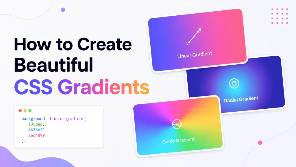
CSS gradients are smooth transitions between two or more colors that can be generated directly by the browser. The three main types are linear, radial, and conic gradients. You can control their direction, position, color stops, and other properties to create backgrounds for websites, buttons, cards, hero sections, and UI components.
For example:
.hero { background: linear-gradient(to right, #6366f1, #ec4899); }This creates a simple gradient that transitions from purple to pink.
CSS gradients are treated as images, so they can be used in properties such as background and background-image. They are generated dynamically rather than requiring a separate image file.
Understanding the Three Main CSS Gradient Types
Before creating complicated effects, understand what each gradient type is designed to do.
| Gradient type | How it works | Common use |
|---|---|---|
linear-gradient() |
Colors transition along a straight line | Hero sections, buttons, banners |
radial-gradient() |
Colors spread outward from a center | Glows, cards, highlights |
conic-gradient() |
Colors rotate around a center point | Color wheels, charts, decorative effects |
1. Linear Gradients
A linear gradient transitions between colors along a straight line.
background: linear-gradient(to right, #4f46e5, #ec4899);You can change the direction:
background: linear-gradient(to bottom, #06b6d4, #3b82f6);You can also use an angle:
background: linear-gradient(135deg, #6366f1, #ec4899);Angles are particularly useful for modern UI designs because diagonal gradients often create more visual movement than basic horizontal or vertical gradients. MDN documents both directional keywords and angle-based linear gradients.
2. Radial Gradients
A radial gradient spreads outward from a central point.
background: radial-gradient(circle, #f9a8d4, #7c3aed);This is useful when you want a glowing or spotlight-like effect.
For example:
.card { background: radial-gradient( circle at top right, #60a5fa, #312e81 ); }The at position lets you move the center of the gradient.
Radial gradients can use circular or elliptical shapes and allow you to control their position and size.
3. Conic Gradients
A conic gradient transitions around a center point rather than moving along a straight line or radiating outward.
background: conic-gradient( #6366f1, #ec4899, #f59e0b, #6366f1 );Conic gradients are especially useful for decorative effects, color wheels, progress indicators, and pie-chart-like visuals.
How Color Stops Make Gradients Better
One of the easiest ways to improve a CSS gradient is to control its color stops.
A color stop tells CSS where a particular color should appear.
Instead of:
background: linear-gradient(#6366f1, #ec4899);You can write:
background: linear-gradient( 135deg, #6366f1 0%, #8b5cf6 45%, #ec4899 100% );Here, three colors are positioned at specific points.
This gives you much more control over the transition.
Why Color Stops Matter
Without deliberate color stops, CSS distributes colors automatically. By positioning them yourself, you can:
- Make one color more dominant
- Create softer transitions
- Add a third accent color
- Create dramatic contrast
- Control where the visual focus appears
MDN notes that CSS gradients can contain multiple color stops and that their positions can be explicitly controlled.
How to Choose Beautiful Gradient Colors
The biggest mistake beginners make is choosing colors independently.
A gradient usually looks better when its colors have a clear relationship.
Use Similar Colors
For a subtle design, choose colors that are close together.
background: linear-gradient( 135deg, #3b82f6, #6366f1 );Blue and indigo create a smooth, professional transition.
Use Complementary Contrast Carefully
For a stronger visual effect, use colors with more contrast.
background: linear-gradient( 135deg, #06b6d4, #8b5cf6 );The colors are different enough to stand out without becoming chaotic.
Avoid Too Many Colors
Adding six or seven unrelated colors does not automatically make a gradient better.
A good starting rule is:
Use two colors for simple gradients and three colors when you need an accent or more depth.
The goal is not to use as many colors as possible. The goal is to create a controlled visual transition.
5 Beautiful CSS Gradient Examples
Here are several practical gradients you can copy and customize.
Modern Purple Gradient
background: linear-gradient( 135deg, #6366f1, #a855f7, #ec4899 );Good for:
- Hero sections
- SaaS websites
- Landing pages
- Promotional banners
Ocean Gradient
background: linear-gradient( 135deg, #06b6d4, #3b82f6 );Good for:
- Technology websites
- Dashboards
- Buttons
- Cards
Sunset Gradient
background: linear-gradient( 135deg, #f97316, #ec4899 );Good for:
- Creative websites
- Social media designs
- Marketing sections
Soft Radial Glow
background: radial-gradient( circle at top right, #c4b5fd, #312e81 );Good for:
- Feature cards
- Background decorations
- Dark interfaces
Colorful Conic Gradient
background: conic-gradient( from 45deg, #6366f1, #ec4899, #f59e0b, #10b981, #6366f1 );Good for:
- Decorative elements
- Color wheels
- Circular UI components
How to Create a Gradient Background Step by Step
If you are new to CSS, use this simple process.
Step 1: Choose Your Purpose
Decide what the gradient is supposed to do.
For example:
- Background decoration
- Button emphasis
- Hero section
- Card highlight
- Glowing effect
Step 2: Choose Two Base Colors
Start with two colors rather than trying to build a complex gradient immediately.
#6366f1 #ec4899
Step 3: Choose the Gradient Type
Use:
linear-gradient()for directional transitionsradial-gradient()for glowing effectsconic-gradient()for circular transitions
Step 4: Adjust the Direction
Try a diagonal angle such as:
135deg
or use directional keywords:
to right
Step 5: Add Color Stops
If the basic gradient feels too plain, add a third color and position the stops.
Step 6: Test It on the Actual Component
A gradient that looks great in a small preview might look completely different when applied to a full-width hero section.
Always test the gradient at the size and layout where visitors will actually see it.
Use a CSS Gradient Generator to Work Faster
Writing gradient CSS manually is useful for learning, but you do not always need to calculate every color stop and angle yourself.
A CSS Gradient Generator lets you visually experiment with colors, directions, and gradient types before copying the resulting CSS into your project.
This is especially useful when you are:
- Designing a landing page
- Creating a button style
- Experimenting with brand colors
- Building a UI prototype
- Looking for gradient inspiration
Tip: Use the generator to explore ideas, then inspect the generated CSS so you understand what each value is doing.
How to Layer Multiple CSS Gradients
You can also combine multiple gradients to create more sophisticated backgrounds.
For example:
background: radial-gradient( circle at top left, rgba(255, 255, 255, 0.2), transparent 40% ), linear-gradient( 135deg, #312e81, #7c3aed );The first gradient creates a soft highlight, while the second provides the main background.
This technique can make a simple two-color gradient feel much more dimensional.
Common CSS Gradient Mistakes
Beautiful gradients are usually about restraint.
Using Random Colors
Bright red, green, purple, and yellow may technically work, but they can quickly become visually unpleasant.
Choose a deliberate color palette.
Adding Too Many Color Stops
More stops mean more complexity. If every color has a different purpose, the result can become muddy.
Start with two or three.
Ignoring Text Contrast
A beautiful background is useless if visitors cannot read the text placed on top of it.
Always check whether headings, buttons, and other important content remain readable.
Using Gradients Everywhere
If every card, button, heading, and section uses a gradient, nothing stands out.
Use gradients strategically to create visual hierarchy.
Forgetting Responsive Layouts
A gradient can appear different when an element changes size on mobile.
Test your designs on both desktop and mobile screens.
Practical Tips for Better Gradient Design
Keep these rules in mind:
- Start with two colors.
- Use a consistent color palette.
- Try diagonal angles for modern designs.
- Use color stops when you need more control.
- Use radial gradients for subtle lighting effects.
- Use conic gradients for circular designs.
- Check text readability.
- Test gradients on real components.
- Avoid excessive colors.
- Use gradients to support the design, not replace it.
For additional CSS work, you can also explore the CSS Gradient Generator and related Color Tools on TechbyJeel Tools.
Where CSS Gradients Are Commonly Used
CSS gradients are useful far beyond simple backgrounds.
Common examples include:
- Website hero sections
- Call-to-action buttons
- Navigation elements
- Product cards
- Pricing sections
- Dashboard widgets
- Profile headers
- Loading indicators
- Decorative shapes
- Borders and visual accents
- Overlay effects
Because gradients are generated by the browser, they can scale with their containing element instead of relying on a fixed raster image.
CSS Gradient Cheat Sheet
| Goal | Recommended CSS |
|---|---|
| Horizontal transition | linear-gradient(to right, ...) |
| Diagonal transition | linear-gradient(135deg, ...) |
| Vertical transition | linear-gradient(to bottom, ...) |
| Soft glow | radial-gradient(circle, ...) |
| Positioned glow | radial-gradient(circle at top right, ...) |
| Circular color effect | conic-gradient(...) |
| Repeating stripes | repeating-linear-gradient(...) |
| Repeating circles | repeating-radial-gradient(...) |
| Repeating circular pattern | repeating-conic-gradient(...) |
CSS also provides repeating versions of linear, radial, and conic gradients for patterns and repeated effects.
External References
For the most accurate technical details, refer to:
- MDN - Using CSS Gradients
- MDN - CSS Gradient Data Type
- MDN - linear-gradient()
- MDN - radial-gradient()
- MDN - conic-gradient()
Conclusion
Learning how to create beautiful CSS gradients is mostly about understanding the relationship between colors, direction, color stops, and the purpose of the design. Start simple with two colors, then introduce additional stops or layered gradients when you actually need more depth.
Linear gradients are ideal for directional effects, radial gradients work well for glows, and conic gradients are useful for circular visual effects. The best gradients are usually controlled and purposeful rather than overloaded with colors.
Ready to experiment? Try the CSS Gradient Generator on TechbyJeel Tools and create your next gradient without writing every value manually.
Frequently Asked Questions
What is a CSS gradient?
A CSS gradient is a browser-generated image that creates a smooth transition between two or more colors. CSS supports linear, radial, and conic gradients, along with repeating versions. Gradients can be used for backgrounds and other properties that accept image values without requiring a separate image file.
What is the best CSS gradient for a website background?
A linear gradient is usually the easiest starting point for a website background because you can control its direction with keywords or angles. A diagonal 135deg gradient is commonly useful for modern hero sections, while radial gradients can add subtle lighting or depth to a design.
How many colors should a CSS gradient use?
There is no fixed limit, but two colors are usually a good starting point. Three colors can add depth or an accent, while too many unrelated colors may make the design look cluttered. Choose colors that belong to a consistent palette and test the gradient against the content placed on top.
Can CSS gradients replace background images?
For many simple visual effects, yes. CSS gradients can create smooth backgrounds, patterns, glows, and decorative effects without a separate raster image. However, gradients cannot replace photographs, detailed illustrations, or other complex visual assets that require actual image content.
How do I make a CSS gradient look better?
Start with a small color palette, choose colors that work well together, and use a deliberate direction. Add color stops only when you need more control. Also check text contrast and test the gradient at the actual size of your website component rather than judging it only in a small preview.