


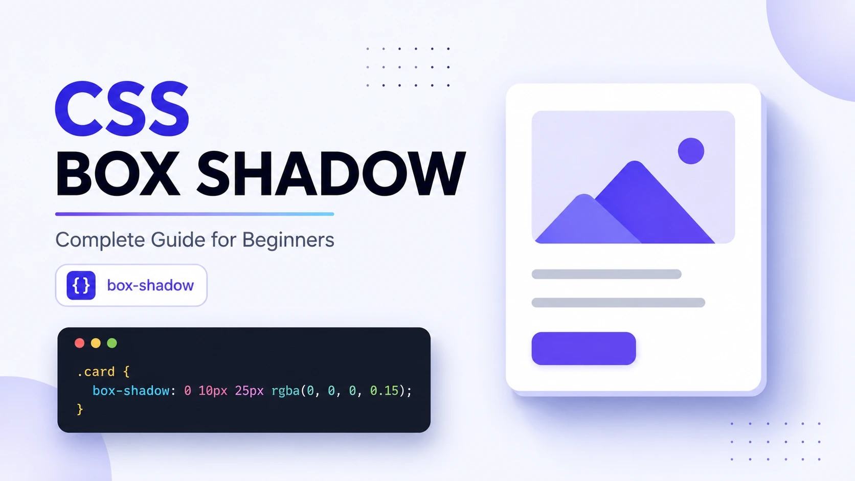
A good shadow can make a flat web page feel polished, layered, and easier to understand. A bad shadow can make the same interface look heavy, outdated, or visually messy.
If you are learning CSS, CSS box shadow is one of the easiest properties to start experimenting with because you can create useful effects with a single line of code. In this guide, you will learn how box-shadow works, what every value means, how to create inset and multiple shadows, and how to choose shadow values that actually improve a design.
What Is CSS Box Shadow?
CSS box shadow is a CSS property that adds one or more shadow effects around an element's box. A shadow can be positioned horizontally and vertically, blurred, expanded or contracted, colored, and placed inside the element using inset. You can also combine multiple shadows by separating them with commas.
For example:
.card { box-shadow: 0 4px 12px rgb(0 0 0 / 20%); }This creates a subtle shadow below the card.
The box-shadow property is commonly used for:
- Cards
- Buttons
- Navigation menus
- Modals
- Input fields
- Images
- Dropdowns
- Product boxes
- Dashboard components
- Hover effects
If you are building websites and want to understand CSS visually rather than memorizing values, experimenting with a CSS Box Shadow Generator can save a lot of time.
CSS Box Shadow Syntax Explained
The basic syntax looks like this:
box-shadow: offset-x offset-y blur-radius spread-radius color;For example:
box-shadow: 5px 10px 15px 2px rgb(0 0 0 / 25%);Here is what each value does:
| Value | Purpose | Example |
|---|---|---|
| offset-x | Moves the shadow left or right | 5px |
| offset-y | Moves the shadow up or down | 10px |
| blur-radius | Controls how soft the shadow is | 15px |
| spread-radius | Expands or contracts the shadow | 2px |
| color | Sets the shadow color | rgb(0 0 0 / 25%) |
| inset | Places the shadow inside the element | inset |
The first two length values are the horizontal and vertical offsets. The third value controls blur, while the fourth controls spread. Blur cannot be negative, while spread can be positive or negative.
1. Offset-X
offset-x controls horizontal movement.
box-shadow: 10px 0 10px rgb(0 0 0 / 20%);- Positive value: moves the shadow right
- Negative value: moves the shadow left
- 0: keeps it horizontally centered
2. Offset-Y
offset-y controls vertical movement.
box-shadow: 0 10px 10px rgb(0 0 0 / 20%);- Positive value: moves the shadow down
- Negative value: moves the shadow up
- 0: keeps it vertically centered
A simple way to remember the first two values is:
X = left / right Y = up / down
3. Blur Radius
The blur radius controls how soft the shadow looks.
box-shadow: 0 5px 5px black;A smaller blur creates a sharper shadow:
box-shadow: 0 5px 5px rgb(0 0 0 / 20%);A larger blur creates a softer shadow:
box-shadow: 0 5px 30px rgb(0 0 0 / 20%);The larger the blur value, the wider and softer the shadow becomes. Negative blur values are invalid.
4. Spread Radius
Spread controls the size of the shadow before blurring.
box-shadow: 0 5px 10px 5px rgb(0 0 0 / 20%);A positive spread expands the shadow.
box-shadow: 0 0 10px 5px rgb(0 0 0 / 20%);A negative spread contracts it.
box-shadow: 0 0 10px -3px rgb(0 0 0 / 20%);Spread is especially useful when you want to control the visible footprint of a shadow without relying only on blur.
5. Shadow Color
You can use named colors, hexadecimal colors, RGB, HSL, or modern color notation.
For UI design, semi-transparent black is often a useful starting point:
box-shadow: 0 4px 12px rgb(0 0 0 / 20%);The important part is not making the shadow completely black. Lower opacity usually creates a more natural result.
How to Create a Basic CSS Box Shadow
Start with a simple card:
<div class="card"> <h2>Hello CSS</h2> <p>This card has a box shadow.</p> </div>Then add CSS:
.card { width: 300px; padding: 24px; background: white; border-radius: 12px; box-shadow: 0 6px 20px rgb(0 0 0 / 15%); }The result is a card that appears slightly elevated from the page.
This is one of the most common uses of CSS box shadow in modern interfaces.
Practical tip: Start with a small opacity and moderate blur. If you can immediately notice the shadow before noticing the content, it is probably too strong.
What Is an Inset CSS Box Shadow?
An inset shadow appears inside an element instead of outside it. Adding the inset keyword changes an outer shadow into an inner shadow, creating an appearance similar to a pressed, recessed, or embedded surface.
Example:
.input { box-shadow: inset 0 2px 6px rgb(0 0 0 / 15%); }You can use inset shadows for:
- Text fields
- Pressed buttons
- Recessed panels
- Neumorphism-style interfaces
- Inner borders
- Decorative effects
For example:
.button { box-shadow: inset 0 2px 4px rgb(0 0 0 / 20%); }The shadow appears within the button rather than outside it.
How to Use Multiple CSS Box Shadows
One of the most useful features of box-shadow is the ability to apply multiple shadows.
Separate each shadow with a comma:
.card { box-shadow: 0 2px 6px rgb(0 0 0 / 10%), 0 10px 25px rgb(0 0 0 / 12%); }You can combine different effects:
.card { box-shadow: 0 2px 4px rgb(0 0 0 / 10%), 0 8px 20px rgb(0 0 0 / 12%), inset 0 1px 0 rgb(255 255 255 / 50%); }Multiple shadows are useful when you want more control over depth.
The order matters. The first shadow is painted above later shadows in the shadow list.
A Simple Layered Shadow
For a polished card, try:
.card { box-shadow: 0 1px 3px rgb(0 0 0 / 10%), 0 8px 24px rgb(0 0 0 / 12%); }This creates a small close shadow plus a larger soft shadow.
CSS Box Shadow Examples You Can Copy
Subtle Card Shadow
box-shadow: 0 4px 12px rgb(0 0 0 / 12%);Stronger Card Shadow
box-shadow: 0 10px 30px rgb(0 0 0 / 18%);Floating Button
box-shadow: 0 6px 16px rgb(0 0 0 / 20%);Top Shadow
box-shadow: 0 -4px 12px rgb(0 0 0 / 12%);Glow Effect
box-shadow: 0 0 20px rgb(59 130 246 / 40%);Inset Shadow
box-shadow: inset 0 2px 8px rgb(0 0 0 / 15%);Sharp Border-Like Effect
box-shadow: 0 0 0 2px rgb(59 130 246 / 40%);Notice that a shadow does not have to look like a traditional blurred shadow. With zero blur and controlled spread, it can create a border-like effect.
CSS Box Shadow vs Text Shadow
These properties sound similar but are designed for different things.
| Feature | box-shadow | text-shadow |
|---|---|---|
| Applies to | Element boxes | Text |
| Blur | Yes | Yes |
| Spread | Yes | No |
| Inset | Yes | No |
| Multiple shadows | Yes | Yes |
| Typical use | Cards, buttons, panels | Headings, labels, decorative text |
Use box-shadow when you want to create depth around an element.
Use text-shadow when you want to create a shadow behind characters.
MDN documents these as separate CSS properties with different syntax and behavior.
Common CSS Box Shadow Mistakes
1. Using Pure Black at High Opacity
This is a common beginner mistake:
box-shadow: 10px 10px 20px black;The result can look harsh.
Try a transparent shadow instead:
box-shadow: 10px 10px 20px rgb(0 0 0 / 15%);2. Making the Blur Too Large
Huge blur values can make an element appear surrounded by fog instead of depth.
Start small and increase gradually.
3. Using Too Many Shadows
Multiple shadows are powerful, but adding five or six layers without a clear reason usually creates visual noise.
Use multiple shadows when each layer has a purpose.
4. Ignoring Background Contrast
A shadow that looks perfect on white may disappear on a gray or colored background.
Always test the shadow against the actual background of your website.
5. Using Shadows Everywhere
Not every element needs elevation.
If every card, button, input, and heading has a shadow, nothing feels visually important anymore.
Good UI design uses shadows selectively.
How to Choose Better Shadow Values
There is no universal "perfect" CSS box shadow. The right values depend on the size of the element, background, design style, and visual hierarchy.
A practical starting point is:
box-shadow: 0 4px 12px rgb(0 0 0 / 12%);Then adjust one value at a time.
Use This Process
1. Set offset-x to 0.
2. Choose a small positive offset-y.
3. Add moderate blur.
4. Keep spread at 0.
5. Use a semi-transparent color.
6. Adjust opacity before dramatically increasing blur.
7. Compare the result with the rest of the page.
This approach is much easier than randomly changing every value.
Use a CSS Box Shadow Generator
You do not need to memorize shadow values.
If you are experimenting with different combinations of offset, blur, spread, color, and inset effects, a CSS Box Shadow Generator lets you adjust the values visually and copy the resulting CSS.
This is especially useful when:
- You are still learning CSS
- You want to create shadows quickly
- You need several shadow variations
- You are matching an existing design
- You want to experiment without repeatedly editing CSS
Try the CSS Box Shadow Generator on TechbyJeel Tools to build and test your shadow visually.
You can also explore other useful developer utilities such as the JSON Formatter when working with front-end configuration or APIs.
Best Practices for CSS Box Shadows
Keep these rules in mind when designing a website:
- Use subtle shadows for most UI components.
- Use consistent shadow direction across your interface.
- Use transparency instead of solid black whenever possible.
- Keep similar components visually consistent.
- Use inset shadows when you want a recessed appearance.
- Use multiple shadows only when they add meaningful depth.
- Test shadows on both desktop and mobile layouts.
- Check that shadows do not reduce text or control visibility.
- Avoid relying on shadows alone to communicate important states.
CSS shadows are decorative effects. They should support your interface rather than become the interface.
Quick CSS Box Shadow Cheat Sheet
| Goal | Example |
|---|---|
| Small elevation | 0 2px 6px rgb(0 0 0 / 12%) |
| Medium elevation | 0 6px 16px rgb(0 0 0 / 15%) |
| Large elevation | 0 12px 30px rgb(0 0 0 / 18%) |
| Inner shadow | inset 0 2px 8px rgb(0 0 0 / 15%) |
| Glow | 0 0 20px rgb(59 130 246 / 40%) |
| Shadow above | 0 -4px 12px rgb(0 0 0 / 12%) |
| Border-like shadow | 0 0 0 2px rgb(0 0 0 / 15%) |
Frequently Asked Questions
What is CSS box shadow?
CSS box shadow is a property used to add one or more shadow effects around an element's box. You can control its horizontal and vertical position, blur, spread, color, and whether the shadow appears inside the element. It is commonly used to create depth around cards, buttons, panels, and other interface components.
What is the basic CSS box shadow syntax?
The common syntax is box-shadow: offset-x offset-y blur-radius spread-radius color;. The first two values control horizontal and vertical position, the third controls blur, the fourth controls spread, and the final value controls color. Blur and spread are optional, so simpler shadows can use fewer values.
How do I create an inset shadow in CSS?
Add the inset keyword to the box-shadow declaration. For example, box-shadow: inset 0 2px 8px rgb(0 0 0 / 15%); creates a shadow inside the element. Inset shadows are useful for recessed panels, input fields, pressed buttons, and other internal depth effects.
Can CSS have multiple box shadows?
Yes. CSS supports multiple box shadows by separating individual shadows with commas. For example, box-shadow: 0 2px 5px #0002, 0 10px 20px #0002; creates two shadow layers. Multiple shadows can be useful for creating more natural depth, highlights, or complex visual effects.
What is the difference between box-shadow and text-shadow?
box-shadow creates shadows around an element's box, while text-shadow creates shadows around text. Box shadows support a spread radius and the inset keyword, which are not part of normal text-shadow syntax. Choose the property based on whether you are styling an element or its text.
Conclusion
CSS box shadow is a small CSS property with a surprisingly large impact on interface design. By understanding offset, blur, spread, color, and inset, you can create everything from subtle card elevation to glowing and recessed effects.
The biggest mistake is thinking that stronger shadows automatically create better designs. In most modern interfaces, subtle shadows, consistent direction, and controlled opacity produce cleaner results.
If you want to experiment without manually adjusting CSS values, try the CSS Box Shadow Generator on TechbyJeel Tools. Then explore more free developer tools and use what you learn to build cleaner, more polished interfaces.